Local SEO Mastery: Personal injury law is often a local service. People search for “injury lawyer near me” or “<city> car accident attorney.” Top sites ensure they dominate these local searches. They do this by creating individual location pages or sections (if the firm serves multiple areas) optimized with local keywords and landmarks (e.g., “Serving clients across Toronto and the GTA, including Mississauga, Brampton, and Oshawa”). They claim, integrate, and optimize their Google Business Profile information, often embedding Google Maps on the contact page and listing their office addresses clearly (with schema markup for LocalBusiness including address and phone). With Apple Maps gaining traction in recent years, it will also be a good move to optimize your Apple Maps business listing. Many also feature local testimonials (“John from Vancouver…”), which naturally includes location context. Another tactic is using geo-specific blog posts, like “Understanding ICBC claims in British Columbia” or “How winter road conditions in Denver affect accident claims,” which can capture local search queries.
15 Best Personal Injury Lawyer Websites for 2026
A comprehensive guide showcasing 15 of the best personal injury law firm websites in 2026 – with examples, design tips, conversion strategies, SEO insights, and a technical checklist for your next redesign.

Best Personal Injury Lawyer Websites (2026)
A personal injury law firm’s website can be the deciding factor between a new client call and a lost lead. In fact, for 75% of consumers, a poorly designed website raises red flags about a firm’s credibility. In the highly competitive personal injury sector, having one of the best personal injury lawyer websites isn’t just about bragging rights; it’s about building trust, generating leads, and converting visitors into clients. More than one-third of potential clients start their attorney search online, so your website often forms the first impression of your law practice.
This article showcases 15 top-performing personal injury law firm websites (with balanced coverage across Canada and the U.S.) and breaks down what works on each site and key takeaways you can apply. We’ll also explore what great PI websites get right in terms of user experience (UX), information architecture (IA), mobile/responsive design, ADA accessibility, and speed.
Key Elements of an Outstanding Personal Injury Law Firm Website
To rise above the competition, a personal injury lawyer’s website must check several critical boxes. Below are the key elements that top personal injury (PI) websites consistently get right:
-
User-Friendly Navigation & Information Architecture: The best PI websites are incredibly easy to use and navigate. Clear menus and well-organized page hierarchies help users quickly find info on attorneys, practice areas, case results, and contact options. For example, Grillo Law’s site is intuitive, with straightforward menus and prominent “Free Consultation” buttons guiding visitors to take action.
Key tip: Keep your navigation simple and logical (e.g., group pages under clear headings like “About Us,” “Practice Areas,” “Results,” “Contact”) and include a search bar or sitemap for larger sites. Ensure that important info (like your phone number and consultation offer) is accessible from every page (many top sites put contact info in the header and footer for visibility. A well-structured site not only improves user experience but also boosts SEO by helping search engines crawl your content efficiently.
-
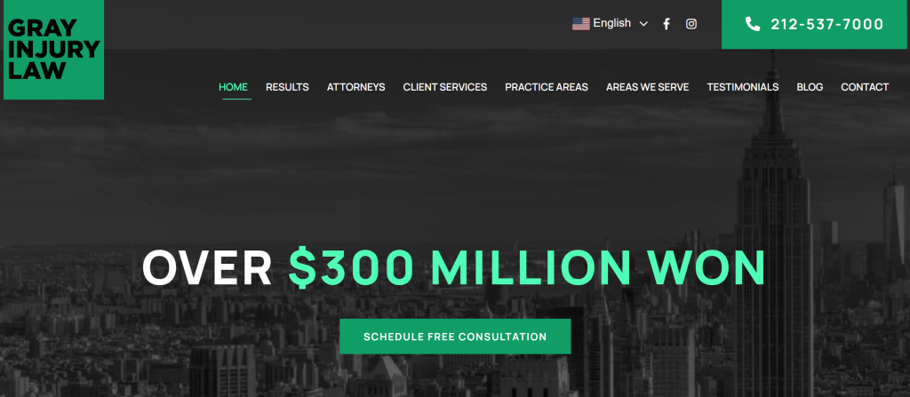
Professional, Trust-Building Design: First impressions will always matter. A polished, modern design with your branding instills confidence. Leading PI sites use thoughtful color schemes, imagery, and typography to convey expertise and empathy. Avoid clutter and outdated graphics. Use high-quality photos of your attorneys and genuine imagery instead of generic stock photos. Note that authenticity builds trust. Many top firms prominently display trust badges, awards, and client testimonials on the homepage to establish credibility at a glance. For instance, Gray Injury Law’s website highlights notable case results and testimonials right up front, reinforcing the firm’s track record and trustworthiness.
Key tip: Incorporate visual proof of your success (settlement amounts, verdicts, reviews, “As Seen In” logos) in a tasteful, readable way. A professional design that blends modern elements with your firm’s personality (e.g., using your logo and firm colors consistently) will set the right tone. Remember, your website is an extension of your firm’s brand; it should feel trustworthy and client-focused.
-
Mobile-Friendly & Responsive Layout: Great PI websites work flawlessly on all devices. With more than half of web traffic now on mobile, a responsive design is non-negotiable. Sites that aren’t mobile-friendly will not only frustrate users but also rank lower on Google’s mobile-first index. Sites that rank top use responsive frameworks that adapt content and buttons for smaller screens, ensuring text is legible without zooming, menus collapse into mobile-friendly formats, and tap targets (links, buttons) are easily clickable on touchscreens.
Key tip: Test your site on multiple devices (phones, tablets) and ensure load times and layouts are optimized for mobile. Google recommends aiming for a load time of under 3 seconds on mobile; beyond that, bounce rates increase dramatically (the probability of a visitor “bouncing” rises 32% as page load goes from 1s to 3s). A fast, responsive mobile design will keep visitors engaged and signal quality to search engines.
-
ADA Accessibility Compliance: Leading personal injury websites prioritize accessibility so that all users can access them. This means that those with disabilities can navigate and use the site. It not only expands your reach (and avoids potential ADA lawsuits) but also demonstrates your firm’s commitment to client service. Key accessibility practices include: ensuring sufficient color contrast in text and backgrounds (for readability), adding descriptive alternative text (alt tags) to images for screen readers, using clear headings and labels, and providing transcripts or captions for video/audio content.
-
Fast Loading Speeds: Speed can make or break your site’s performance. Users are usually impatient. Google reports that most people will leave a site if it takes more than 3 seconds to load. The best PI websites invest in performance optimizations: compressed images, efficient code, caching, and quality hosting. A fast site keeps visitors from bouncing and is favored in search rankings.
Key tip: Aim for load times of less than 3 seconds on both desktop and mobile. Optimize images (use modern formats and proper sizing), minify CSS/JS files, and leverage a Content Delivery Network (CDN) if you have users across various regions. Regularly test your pages with Google PageSpeed Insights or GTmetrix and address any red flags.
15 Best Personal Injury Lawyer Websites (with Examples & Takeaways)
Below we feature fourteen of the top personal injury law firm websites in North America (including examples from both the U.S. and Canada). Each mini-review includes the firm name, URL, what stands out about their site (“what works”), and a key takeaway you can apply to your own website redesign. These sites were chosen for their performance in areas like design, content, user experience, and conversion results.
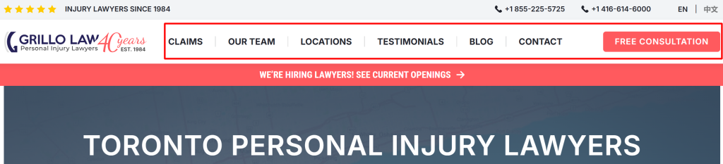
1. Grillo Law — Personal Injury Lawyers (Toronto, ON)
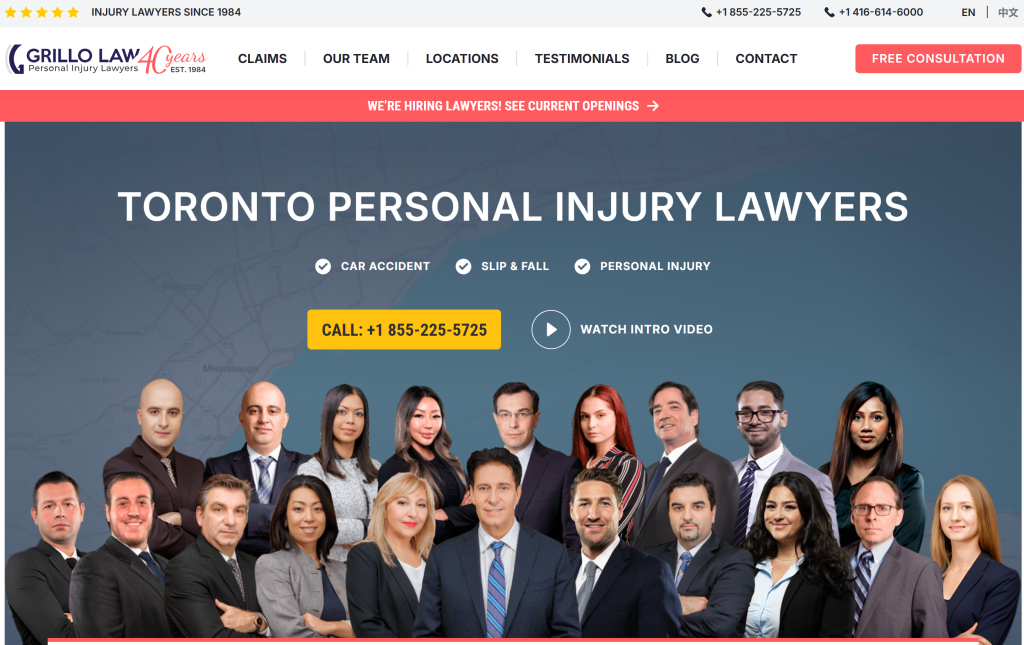
What Works: Grillo Law’s website succeeds by blending trust, accessibility, and conversion-focused design into a cohesive experience. It immediately establishes credibility through its legacy tagline, “Injury Lawyers Since 1984,” and transparent case results, while client reassurance comes from bold, repeated promises like “No fees unless we win.” Navigation is simple and client-first, with clear practice area explanations, a quick intake form at the top of the page, and multiple office locations across Ontario to emphasize reach. Social proof is woven throughout via strong Google ratings and authentic client testimonials, while authority is reinforced by showcasing the firm’s extensive team and network of medical and forensic experts. Altogether, the site balances authority with empathy, ensuring visitors quickly understand what the firm does, why it can be trusted, and how to engage.
Key Takeaways: Grillo Law demonstrates how a legacy of experience combined with plain, client-first language and visible results can build instant trust. Their clear intake process, backed by contingency fee reassurance and demonstrated results, lowers the barrier to contact. Additionally, amplifying the firm’s breadth of service and extensive office network enhances both client relevance and discoverability. In essence, this is a strong model of authority, accessibility, and conversion-focused design working in harmony.
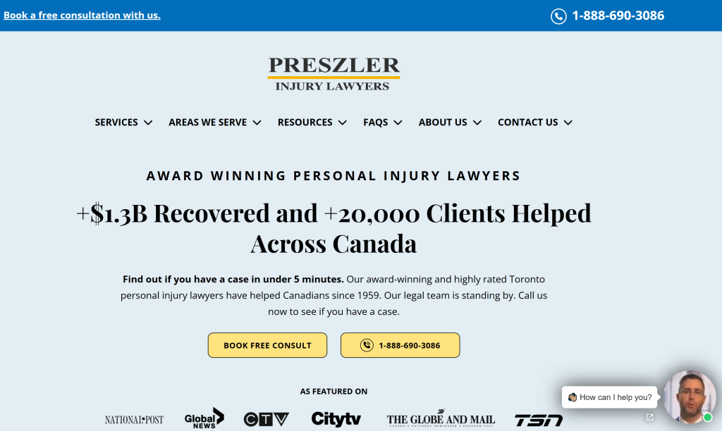
2. Preszler Injury Lawyers – Nova Scotia & New Brunswick
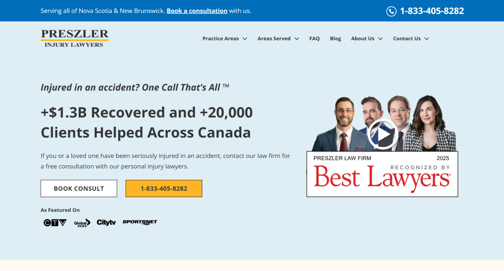
What Works: Preszler’s Atlantic Canada site excels at combining scale with local reach. The bold stats ($1.3B recovered, 20,000+ clients) and the trademarked slogan “One Call That’s All” grab attention instantly, while multiple office locations and province-specific pages make the site relevant to local users. The navigation is comprehensive but clear, allowing users to browse by injury type or city. Content depth is a real strength: extensive FAQs, detailed practice area pages, and transparent commitments (“No Win No Fee”) address both emotional hesitations and practical concerns. Conversion is reinforced through constant CTAs, visible 24/7 phone lines, and Google review snippets embedded directly on the homepage for instant social proof. The site’s innovation lies in its hybrid model: a national firm identity paired with hyper-local accessibility, plus marketing hooks like the 1-800-JUSTICE® number that make the brand memorable.
Key Takeaways: Preszler’s NS/NB site proves that comprehensive, client-centered content paired with persistent calls-to-action can build both trust and urgency. It shows how firms with broad reach can still feel local and personal online by tailoring navigation, content, and branding to specific communities.
3. Burn Tucker Lachaîne PC (Ottawa, ON)
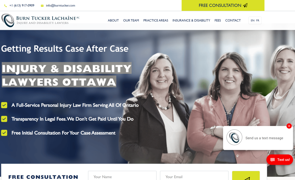
What Works: Burn Tucker Lachaîne’s site reflects modern professionalism with a strong emphasis on accessibility and transparency. The bilingual toggle (English/French) is seamlessly integrated, appealing to a diverse audience and setting them apart in a market where few firms invest in full bilingual experiences. The design is clean and mobile-friendly, with intuitive navigation that breaks down practice areas into clear categories. Conversion tools are everywhere: from the free consultation modal form (that pops up without disrupting navigation) to reassuring copy about “no fees unless you win.” Transparency is reinforced not just in pricing but even in crisis management—the firm openly addressed a cybersecurity incident on its homepage, signaling honesty and accountability. Long-form testimonials featuring real client voices provide persuasive social proof, while blog updates demonstrate the firm’s ongoing engagement with legal issues.
Key Takeaways: Burn Tucker Lachaîne illustrates that innovation in legal websites isn’t just about flashy design—it’s about being transparent, accessible, and human. Their bilingual functionality, openness about fees and even data issues, and emphasis on client stories create a trustworthy, approachable presence that helps potential clients feel supported before they even pick up the phone.
4. Thomson Rogers (TR Law) – Personal Injury Lawyers (Toronto, ON)
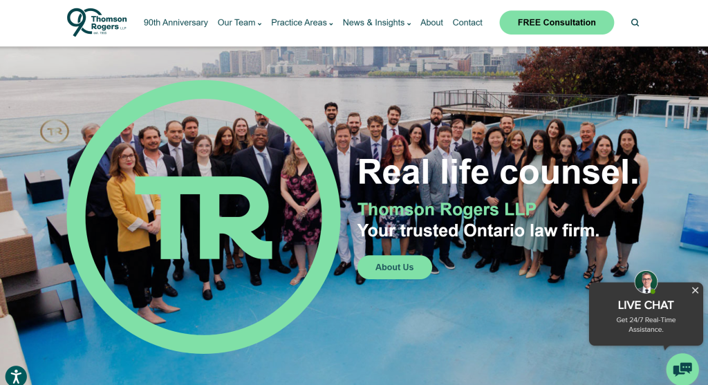
What works: Thomson Rogers’ website stands out by blending heritage and modernity. The design reflects 90+ years of authority while integrating modern visuals, bold typography, and award banners that reinforce credibility (e.g., 24 lawyers recognized in 2026). Navigation is expertly handled with mega-menus across practice areas, team categories, and insights, plus search functionality for ease of access. Content is vast yet curated: from accolades and firm history to dynamic newsfeeds and extensive practice area resources, the site positions TR as both thought leaders and community partners. Conversion is streamlined via a constant “Free Consultation” button, tap-to-call on mobile, and newsletter sign-ups, all reinforced with trust badges and testimonials. Distinctive features include the 90th Anniversary hub, community partnership showcases, and innovative team transparency (contact details for clerks and assistants as well as lawyers). TR Law’s site demonstrates that longevity, breadth, and innovation can coexist, resulting in a platform that informs, impresses, and converts.
Key Takeaways: The Thomson Rogers website demonstrates that combining tradition with modern web practices can result in a highly effective law firm website. Key lessons include the importance of showcasing credibility through concrete accolades and history. The clients visiting the site are immediately reassured by the firm’s 90-year legacy and ongoing recognition. At the same time, the site’s modern features (fresh content feeds, intuitive navigation, mobile optimization) show that even the most established firms must stay current to meet user expectations. Another takeaway is the value of comprehensive content organization: by structuring a vast amount of information in a user-friendly way, Thomson Rogers makes expertise accessible and fosters trust. Ultimately, TR Law’s site teaches that a large law firm can be informative, approachable, and conversion-focused all at once and it’s about thoughtful design, rich content, and clear calls-to-action working in harmony.
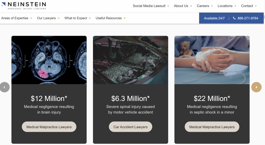
5. Jacob D. Fuchsberg Law Firm – Personal Injury & Civil Rights Lawyers (New York, NY)
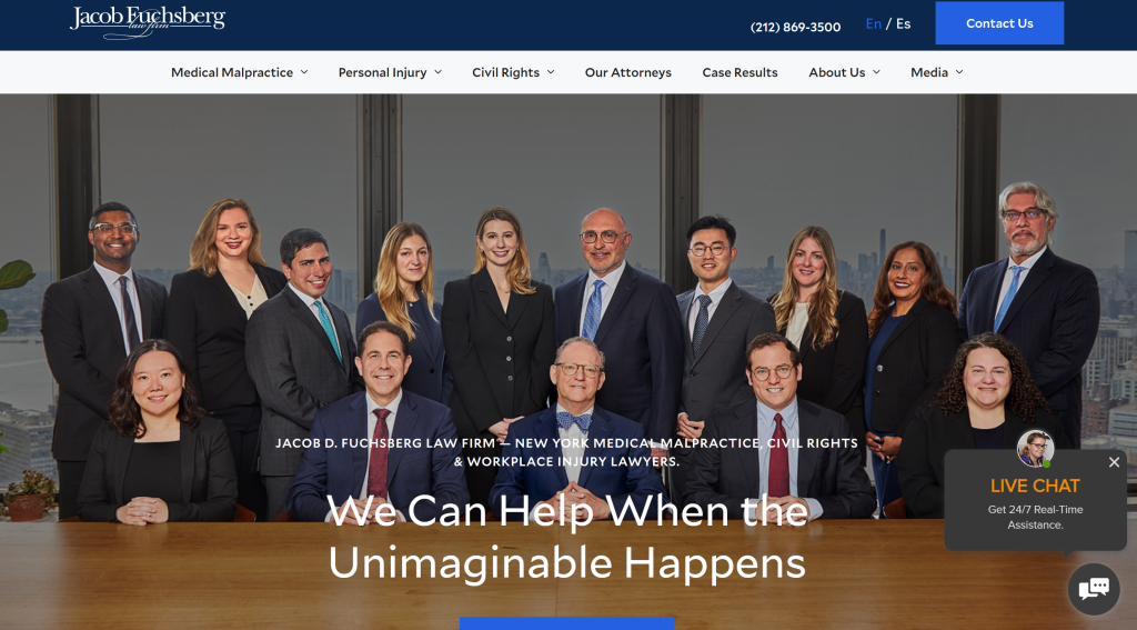
What works: The Fuchsberg Law Firm’s website seamlessly blends a traditional law firm feel with modern functionality. At first glance, it conveys history and gravitas. The homepage features imagery of the founding family and mentions of the firm’s decades of experience, but the design is far from dated. A clean, easy navigation bar and well-organized dropdown menus make it simple to explore practice areas and the firm’s backstory. The site excels in storytelling: it highlights the firm’s legacy and notable cases in a visually engaging way, helping potential clients sense the firm’s credibility and compassion. Importantly, the Fuchsberg site is conversion-oriented despite its classic appearance. A prominent “Free Consultation” button and contact form are available above the fold, making it effortless for visitors to reach out. The site also integrates case results and client testimonials, reinforcing trust.
Takeaway: Blend credibility with conversion. A law firm with a long legacy can project its heritage online and still have a high-performing, modern site. Use design to communicate your firm’s values and experience, but don’t forget to include the standard conversion drivers (clear CTAs, contact forms, evidence of results).
6. Meyers Injury Law – Personal Injury Firm (Nashville, TN)
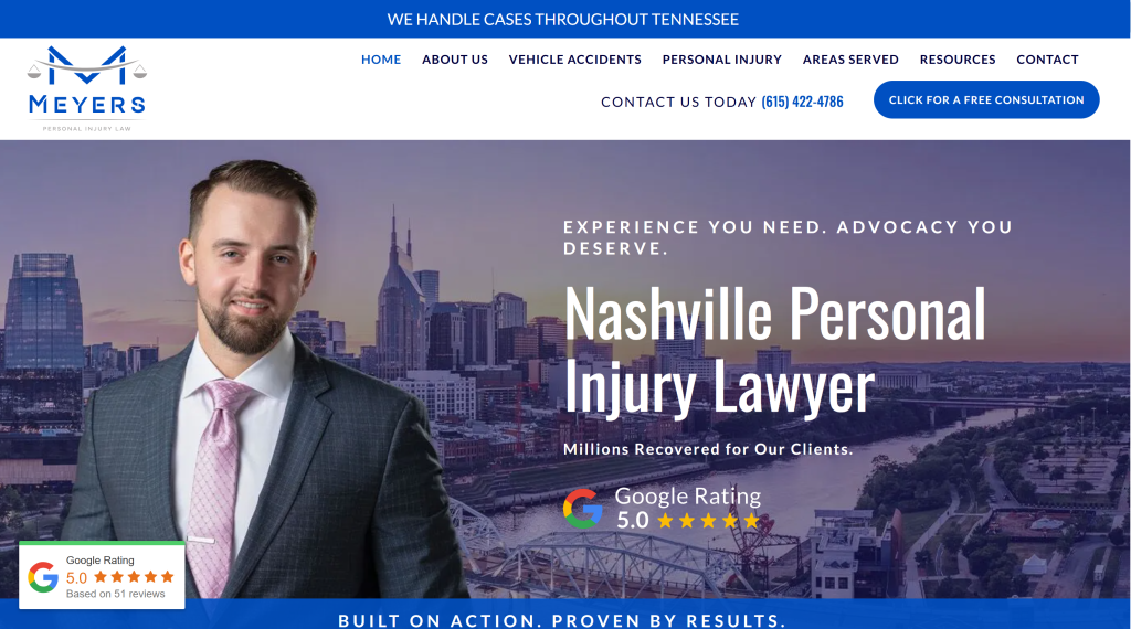
What works: Meyers Injury Law’s website, designed by On The Map Marketing as a “homegrown” project, is a shining example of a conversion-focused yet SEO-friendly site. The design is sleek and uncluttered, using the firm’s bold blue branding to convey trust and stability. Front and center is attorney Chadwick Meyers’ photo and a friendly welcome message, humanizing the firm from the start. The homepage immediately lays out what the firm does (e.g., car accidents, slip and falls, etc.), with each practice area linked to detailed pages. This clear definition of services helps both users and search engines. Social proof is prominently displayed as well: Meyers Injury Law shows off its unique selling proposition and includes badges of professional associations and snippets of client testimonials, signaling credibility. Throughout the site, calls-to-action to schedule a consultation are frequent but tastefully placed, often alongside helpful content rather than as hard sells. The site also pays attention to SEO details: each practice page is content-rich (targeting specific keywords like “Nashville car accident lawyer”), and the site structure is logical. All these elements work in concert, making Meyers’ site both user-friendly and highly effective at converting visitors.
Takeaway: Cover the fundamentals thoroughly. Meyers Injury Law’s site isn’t flashy for the sake of flash. Instead, it nails the basics: clear messaging about services, strong attorney branding, easy navigation, and strategic CTAs. Ensuring your site clearly communicates “who we are, what we do, and why you should trust us”, while gently guiding users to take action, can yield stellar results. It’s possible to have great SEO and great conversion design on one site.
7. Gray Law Firm – Personal Injury Lawyers (Los Angeles, CA)
What works: The Gray Law Firm website demonstrates a deep understanding of its target audience’s priorities. It immediately speaks to what clients care about most: results. On the homepage, bold text announces how much money the firm has recovered for clients, grabbing attention by quantifying their success. This approach (“Never settle for less,” as their slogan says) taps into clients’ desire for a lawyer who will fight for maximum compensation. Despite a minimalist overall design, this strategic highlighting of outcomes hooks visitors emotionally. The site also features an easy-to-find free consultation prompt and phone number at the top, emphasizing 24/7 availability; a key factor for people dealing with urgent injury matters. Gray Law Firm’s navigation is straightforward, with dedicated pages for each practice area (each page outlines how the firm helps in that type of case and showcases relevant victories). The site’s content balances empathy with confidence: it communicates that Gray Law understands clients’ pain points (like dealing with insurance or needing medical care) and is prepared to handle them.
Takeaway: Know your audience’s hot buttons. Gray Law’s site hooks visitors by addressing their main concern (“How can you help me get what I deserve?”) right away. On your website, identify the top 1–2 questions or worries your clients have and make sure your homepage answers them clearly. Whether it’s your track record, your unique approach, or your client service, put that front and center. Coupling that message with strong accessibility (easy contact options, 24/7 chat or phone) ensures that once a client is impressed, they can reach you without delay.
8. The Levin Firm – Personal Injury & Accident Attorneys (Philadelphia, PA)
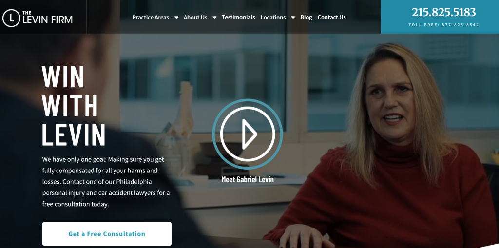
What works: Featured as a standout example by legal marketing experts, The Levin Firm’s website exemplifies a client-focused design philosophy. The homepage greets visitors with a powerful three-word headline: “Win With Levin.” This tagline cleverly centers the client’s perspective, implying you (the client) will win by choosing Levin. It’s a succinct, unique value proposition that sets an aspirational tone. Directly below the headline, a bright call-to-action button invites users to call the firm, and a secondary “Free Consultation” button leads to a simple contact form. Multiple contact avenues (call, email form, even live chat) are offered without feeling overwhelming, because they’re integrated cleanly into the design. Another smart feature is that on attorney bio pages, Levin’s site places each lawyer’s contact info (phone, email) and a “Contact [Name]” button at the very top. This acknowledges that prospective clients or referral sources might land on a bio page and need an immediate way to reach that attorney; Levin’s site delivers that convenience. As users scroll, they find more personalized content: attorney bios that stress how the firm can help you (not just bragging about accolades), and FAQs that educate the reader. The visual design uses contrasts effectively (the blue “Get a Free Consultation” button stands out on a darker background). Importantly, the site is technically sound. It’s fast and uses modern development practices, given its top-tier agency pedigree.
Takeaway: Make it about the client. Levin’s site avoids the common mistake of making the content all about the lawyer. Instead, it’s framed around client success (“you win”), easy contact, and addressing client needs. To emulate this, review your website copy: does it speak to what the client is looking for, or just list your firm’s resume? Shift the focus to how you solve clients’ problems. Always provide multiple, prominent ways for a visitor to contact you when they feel ready. Levin’s use of persistent and well-placed contact options is a model for maximizing conversions.
9. West Coast Trial Lawyers – Personal Injury Lawyers (Los Angeles, CA)
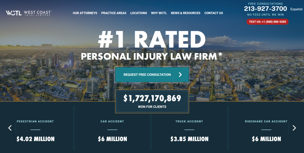
What works: West Coast Trial Lawyers’ website excels at building trust through transparency and accessibility. From the moment you enter, the site emphasizes client-friendly policies: “No fees unless we win” and “Free consultations 24/7” are front and center, immediately breaking down barriers for hesitant visitors. The design is clean with a navy-and-white color scheme, and it features a language toggle for multilingual support – recognizing that in LA, serving clients in their preferred language is a huge plus. Scrolling further, the site showcases impressive case results (multi-million dollar verdicts) and heartfelt client testimonials, reinforcing credibility. These success stories aren’t just listed; they’re designed in a visually appealing way (e.g., verdict amounts in large font alongside brief descriptions of the case) to catch the eye and convey impact. The navigation of the site is particularly well-organized: practice areas are broken down in detail, but the menu uses simple terms (e.g., “Car Accidents,” “Product Liability,” etc.) so users instantly find relevant sections. Each practice area page provides useful information about that type of claim and how the firm can help, which demonstrates expertise (and incidentally helps SEO with rich content).
Takeaway: Be transparent and user-centric. West Coast Trial Lawyers’ site shows that being upfront about what you offer (free consults, no recovery, no fee) can engage users and build trust quickly. Don’t hide the ball; if you have client-friendly policies or big wins, highlight them. Also, consider the diverse needs of your audience: offering content in multiple languages or multiple contact methods can significantly widen your reach. Finally, ensure your site’s information architecture is intuitive; a visitor should never wonder, “Where do I find X?” It should be obvious. A well-structured, transparent site makes visitors feel taken care of before they even call you.
10. Zaner Harden Law – Personal Injury Attorneys (Denver, CO)
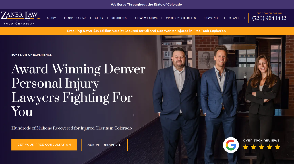
What works: Zaner Harden Law’s website stands out by appealing to both the emotional and practical needs of injury clients. Visually, the site strikes an empathetic tone. You’ll see images of the attorneys interacting kindly with clients and families, sending the message that this firm is compassionate and client-focused. Yet, the content doesn’t shy away from the firm’s impressive legal outcomes: multimillion-dollar verdicts and settlements are prominently noted to establish credibility. The homepage uses strong action phrases (“Fighting for the seriously injured in Colorado”) and immediately offers help via a free consultation form. One notable feature is how the site balances multimedia and text: Zaner Harden includes downloadable guides and even e-books for accident victims (e.g., “What to do after a car crash” resources), providing value to visitors browsing the site. This not only positions the firm as a helpful authority but also likely keeps users on the site longer (which is great for SEO and conversion). The user experience is carefully crafted: navigation tabs for “About Us,” “Case Results,” “Testimonials,” and “Resources” are clearly visible, and each of those pages is rich with information that builds trust.
Takeaway: Address head and heart together. Zaner Harden’s success shows that a great PI website should connect with visitors emotionally (show you care, you listen, you understand their pain) and practically (show you win cases, you have the resources and knowledge to get results). Use content offers like guides or FAQs to demonstrate helpfulness. And from a conversion standpoint, continue reinforcing both angles throughout the site. For example, pair a heartfelt testimonial with a note about the settlement amount, or a comforting image with a bold “Get Your Free Consultation” button. This one-two punch of empathy and efficacy can persuade a visitor that “this firm gets me and can help me.”
11. Preszler Injury Lawyers – Main Site (National/ON)
What Works: Preszler’s main site is a flagship of scale and sophistication, serving as both a marketing engine and an educational hub. It leads with instant credibility by highlighting headline stats, national media features, and award badges like Best Law Firms 2025. Navigation uses a mega-menu structure to organize dozens of practice areas and locations without overwhelming users, proving that even a massive firm can maintain intuitive UX. Conversion is a constant focus: live chat, persistent “Book a Free Consult” buttons, 24/7 hotlines, and repeated assurances of “No Win, No Fee” leave no doubt about next steps. Content is encyclopedic, ranging from FAQs and glossaries to video resources and detailed case results, making the site feel like both a law firm and an authoritative resource center. The branding elements and slogans like “One Call That’s All” and 1-800-JUSTICE® reinforce memorability and professionalism, while the firm’s history since 1959 underscores authority and stability.
Notably, the site balances scale with trust by consistently surfacing real outcomes (case results, testimonials, and media mentions), so users are reassured at every stage that the firm’s size translates into results, not impersonal service.
Key Takeaways: Preszler’s main site shows that comprehensiveness and conversion can coexist. By offering encyclopedic resources alongside relentless CTAs, it serves both information seekers and action-takers. The combination of strong branding, national presence, and client-focused usability makes it one of the most powerful examples of how a personal injury law firm can dominate online visibility.
12. McClellan Law Firm – Serious Injury & Trial Lawyers (San Diego, CA)
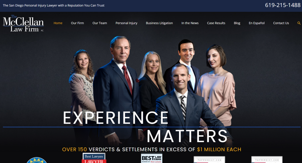
What works: The McClellan Law Firm’s website creates a welcoming and reassuring environment for potential clients, which is an important factor for those who have suffered traumatic injuries. The tone is set with a calm color palette and imagery of the firm’s team interacting with clients, giving an immediate sense of approachability. The copywriting emphasizes the firm’s “client-centered approach” and “personalized attention,” which helps differentiate McClellan from larger impersonal firms. Importantly, the site doesn’t just make claims of compassion; it backs them up with design features. For instance, there’s an easy-to-spot live chat option saying something like “Chat now – We’re here to help,” indicating that someone is available to talk right now. This can be incredibly comforting for a visitor who may be in crisis or filled with questions. Contact options abound: besides chat, there’s a prominent phone number and a simple consultation form, making the site very conversion-friendly for any communication preference. The firm’s case results and awards are listed, but they’re placed below the empathetic messaging, which subtly tells users, “We care about you, and by the way, we also have the proven skills to win.”
Takeaway: Convey compassion through design and content. McClellan’s site teaches that for personal injury clients – who are often stressed and in pain – the feeling of support can be a major differentiator. Ensure your website’s language, imagery, and interactive features (like live chat or prompt callbacks) all send the message that “we’re here for you.” At the same time, continue to provide evidence of your qualifications, but position it in a way that doesn’t overshadow the human element. The goal is for a visitor to leave your site thinking, “This firm cares about me and has what it takes to win my case.”
13. Avanessy Giordano LLP (Toronto, ON)
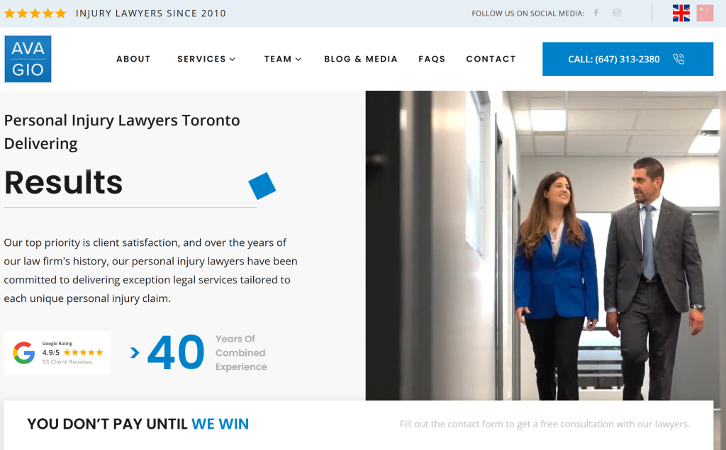
What Works: Avanessy Giordano’s website stands out with its boutique branding and approachable yet professional tone. At first glance, the design conveys personalized advocacy with a clean interface and strong visuals that highlight the firm’s lawyers and their credentials. The decision to list attorneys by name in the top navigation immediately humanizes the experience and reassures clients they’ll work with real people, not just a faceless firm. Content is empathetic yet authoritative. The stories about the founders leaving big firms to create a more client-focused practice establish credibility and authenticity. Conversion features are well-placed: free consultation forms appear high on the page, supported by trust signals like multimillion-dollar settlement results and heartfelt client testimonials. Innovation shows in the site’s ability to balance clarity with compassion; it avoids jargon, using plain, empathetic language that resonates with someone facing trauma after an injury.
Key Takeaways: Avanessy Giordano demonstrates how boutique law firms can punch above their weight online. By weaving personal storytelling with evidence of results, their site appeals both emotionally and logically. The navigation’s simplicity, client-first copy, and conversion-oriented design make it a model for firms looking to combine warmth with professionalism in a highly competitive personal injury market.
14. Slater Vecchio LLP – Personal Injury & Class Action Lawyers (Vancouver, BC)
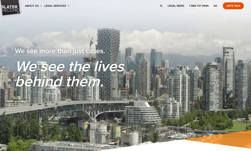
What works: Slater Vecchio’s website is bold, modern, and user-oriented, reflecting the firm’s reputation as a forward-thinking personal injury practice. Visually, the site catches your attention with a vibrant color scheme (featuring energetic green highlights against clean white backgrounds), which conveys a sense of optimism and action. The homepage immediately identifies Slater Vecchio as a national firm fighting for Canadians’ rights, which helps instill confidence that they have broad experience. The design uses strong typography and a mix of icons and images, making key points easy to scan. For instance, they might use an icon of a phone next to “Free Consultation” or a clock icon next to “24/7,” ensuring those benefits don’t go unnoticed. Accessibility and convenience are clearly priorities: a floating “Get a Callback” or “Chat Now” widget is available on every page, meaning help is literally one click away, no matter where you scroll. One impressive feature is the site’s client resources section: Slater Vecchio offers downloadable guides (like a PDF on steps to take after an accident) and has blog posts that answer frequent questions. This positions the firm as not just seeking clients, but genuinely trying to help the community with knowledge. Their approach to content is also strategic. They have pages addressing niche injury topics (e.g., “What to do if you’re in a rideshare accident”), which likely draws in traffic from very specific searches, demonstrating savvy SEO targeting.
Takeaway: Combine innovation with reassurance. Slater Vecchio’s web presence shows that a law firm website can be visually engaging and innovative while still delivering all the reassurances an injury victim needs. Don’t hesitate to infuse your site with modern design elements (colour, icons, interactive features) as long as they serve a purpose in guiding the user. The goal is a site that feels alive and attentive. Ensure that on every page, a visitor has an easy way to contact you or get help (persistent chat or contact buttons).
15. McLeish Orlando LLP – Catastrophic Injury Lawyers (Toronto, ON)
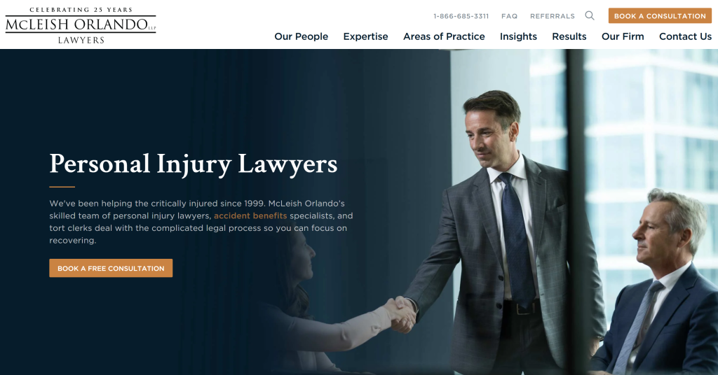
What works: McLeish Orlando is one of Canada’s top personal injury boutique firms, and their website reflects a highly polished, client-first digital strategy. Immediately, the homepage features a compelling full-width image of a client the firm has helped, coupled with a headline like “Serious injuries deserve serious lawyers.” This clear messaging sets McLeish Orlando apart as specialists in complex, high-value cases. The site’s design is sleek and modern; lots of white space, professional photography, and a consistent use of the firm’s branding (red and gray tones). McLeish’s site also integrates video content effectively: a brief intro video of their lawyers talking about the firm’s philosophy is available, which can engage visitors more than text alone. A unique strength of this site is its user experience for intake: the contact page not only has a simple form, but also outlines what to expect when you reach out (e.g. “When you contact us, here’s how our intake process works…”) which can reduce the anxiety a potential client might have about calling a lawyer. Additionally, McLeish Orlando has a notable community presence that the site highlights – their blog and news section includes posts about safety initiatives and firm involvement in advocacy (e.g., promoting bike helmet safety, participating in community events).
Takeaway: Showcase specialization and empathy. McLeish Orlando’s site works so well because it clearly communicates, “We handle the toughest cases and we care deeply about our clients.” If your firm specializes (e.g., only very serious injuries), let that focus shine through in your content and design; you’ll attract your ideal cases. Also, think beyond just legal talk: include content that shows your human side (community work, client stories, videos of attorneys speaking plainly) to build a connection with visitors. Finally, guide prospects gently into contacting you by demystifying the process (tell them what will happen when they call or email). A sophisticated, empathetic site can position a firm as both elite and approachable, a rare but powerful combination.
High-Converting Design Patterns & Client Intake Strategies
The best personal injury websites don’t just look good; they are engineered to convert visitors into leads and ultimately clients. Here are some high-converting design patterns and intake system features consistently seen across top-performing PI sites:
Strong Calls-to-Action (CTAs) on Every Page
Effective calls-to-action guide users toward contacting the firm without ambiguity. All of the top sites we reviewed use clear, compelling CTAs like “Get a Free Case Review”, “Schedule a Free Consultation”, or “Chat with a Lawyer Now.” These CTAs are typically designed as noticeable buttons in contrasting colors, placed prominently, often in the header, within page content, and again at the bottom of pages. For example, Parris Law Firm’s site uses engaging language on its buttons (e.g., “Get Help Now” instead of a generic “Submit”), which can improve click-through because it reminds the user of the benefit.
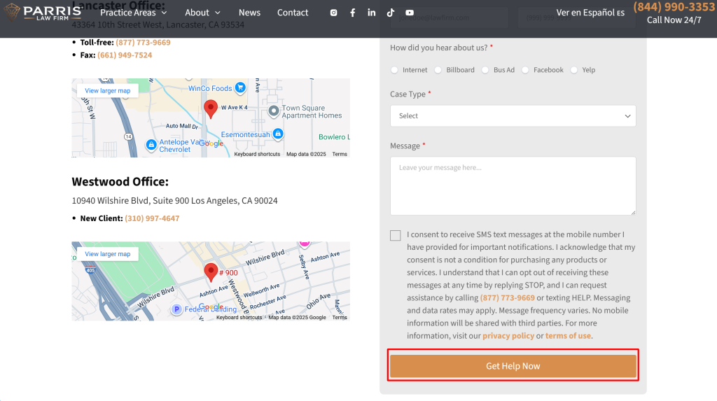
Best practice: include a CTA above the fold on your homepage and contact page, and consider a sticky header or sidebar that keeps a contact button visible as the user scrolls. Ensure the CTA language is action-oriented and value-driven (tell the user what they get). By making it as easy as possible for a prospect to take the next step, you increase your website’s conversion rate significantly.
Good Client Experience
Client-friendly design and communication are at the heart of high-performing PI websites. They consistently avoid legal jargon in favor of clear, plain-language content that speaks to a stressed or injured visitor. Navigation is intuitive, with streamlined menus and service descriptions that quickly answer, “What problems do you solve?” Key conversion elements, such as contact info and multiple CTAs, are always visible without scrolling. Many top sites also integrate online intake forms, allowing prospective clients to start their case right away instead of waiting for a callback.
Best practice: Use short, empathetic sentences rather than complex legal phrasing. Keep navigation limited to 5–6 top-level menu items, each supported by plain descriptions. Ensure your phone number, email, and a consultation button are consistently visible in the header and footer. Add a simple intake form on the homepage so clients can initiate the process instantly, even outside office hours.
Strong Branding
The best PI firm websites ensure that they inform and build identity and trust through consistent branding. They rely on high-quality, original visuals rather than stock images, often showcasing the attorneys themselves to make the firm feel human and accessible. Social proof is woven throughout: testimonials, reviews, and even embedded social posts. Attorney bios double as branding assets, emphasizing mission, values, and authority. Content marketing is central, with regularly updated blogs, videos, and guides that address client pain points while establishing the firm as a thought leader.
Best practice: Invest in professional photos of attorneys, offices, and community events. Dedicate a clear “About” page that highlights both credentials and firm values. Place testimonials or review snippets on high-traffic pages like the homepage and practice area sections. Commit to an editorial calendar for blogs and video content because consistency reinforces authority.
Top Technical Factors
Even the most compelling site will fail if it doesn’t meet technical expectations. High-performing PI websites load quickly (under 2 seconds is the benchmark) and are fully responsive, offering a seamless experience on mobile devices. Accessibility is prioritized with strong color contrast, alt text for images, and intuitive navigation that works for low-vision or limited-mobility users. Behind the scenes, an SEO strategy ensures the site surfaces for relevant local and practice-specific searches. This combination of speed, accessibility, and search visibility directly impacts both usability and rankings.
Best practice: Optimize images and hosting for fast load speeds; use tools like Google PageSpeed Insights to measure performance. Follow WCAG guidelines to ensure your site meets accessibility standards. Design mobile-first, making sure CTAs, forms, and menus are easy to use on small screens. Build SEO foundations with keyword-optimized titles, schema markup, and internal linking so your site is discoverable and competitive on Google.
Simplified Lead Forms & Click-to-Call Features
When it comes to contact forms, short and simple is key. Top PI websites often use minimal lead capture forms asking only for essentials like name, phone, email, and a brief description – they avoid long, daunting questionnaires. This is because a cumbersome form can deter a user who’s in pain or distressed. Additionally, click-to-call features (phone numbers that you can tap on mobile to call directly) are ubiquitous on great sites. Given that 68% of consumers in legal emergencies reach for the phone first, having your phone number not just visible but clickable on mobile is crucial.
Best practice: Limit required form fields to the bare minimum needed for follow-up (you can gather additional details later during the consultation). Mark non-required fields as optional or remove them. Make your phone number and office address on the site clickable links – so a tap initiates a call or opens a maps app for directions. The easier you make it for clients to reach you, the more inquiries you’ll receive.
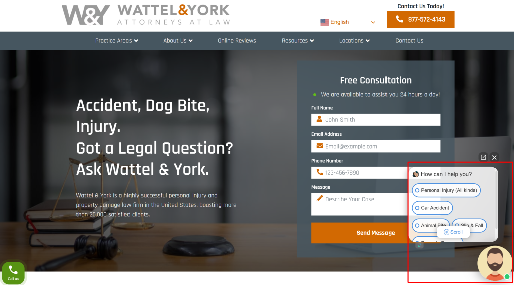
Live Chat and 24/7 Response Availability
Many of the best PI firm websites integrate live chat or at least a chatbot that appears after a few seconds on the site, asking visitors if they need help. Live chat provides instant gratification. So visitors can get an answer or schedule an appointment immediately, even outside of normal office hours. For example, Wattel & York’s site sets a strong example with its readily available live chat and clear contact info, ensuring potential clients can connect anytime. If staffing a 24/7 live chat is challenging, some firms use hybrid chat services where initial responses are automated or handled by a third-party intake service that can collect key info and assure the visitor that the firm will follow up promptly.
Best practice: If possible, implement a live chat widget on your site. Make sure it’s unobtrusive (doesn’t cover important content) but easy to find. It is usually a small chat bubble in the bottom corner. Clearly indicate if it’s a real person or a virtual assistant and respond as quickly as possible. Even if you can’t have true 24/7 live staff, consider after-hours solutions: many firms set up an answering service or chatbot to say, “We’re offline but will be in touch first thing in the morning – please leave your info.” Fast response is critical; studies show law firms that reply within minutes have a far higher chance of securing the client than those who wait days.
Trust Signals: Testimonials, Case Results, and Badges
Trust is currency in legal marketing. High-converting sites showcase social proof and authority symbols prominently to reassure visitors. This includes client testimonials (often with client first name/last initial and sometimes a photo or video for authenticity), case results (big settlements/verdicts with a one-liner context), and badges or logos (awards, ratings, professional memberships). For instance, West Coast Trial Lawyers’ site builds credibility by featuring detailed attorney profiles and case studies. At the same time, Metier Law Firm highlights significant case results and client testimonials on its pages. Another example: Many top sites will have a banner of badges such as “Voted Best Lawyer in City 2026,” “AV Preeminent Rating,” “Million Dollar Advocates Forum,” etc., near the top or bottom of the homepage. These visual cues immediately communicate “recognized and reputable.”
Best practice: Dedicate a section of your homepage (and even each practice area page) to a testimonial or two relevant to that area. Update them periodically to keep them fresh. Keep testimonials concise, focusing on the positive outcome or experience (“They treated me like family and won my case!” is more impactful than a long-winded paragraph). Always get permission from clients before using their words or likeness. Additionally, list a few key case wins (especially ones that prospective clients can relate to, like a car accident settlement amount). Lastly, don’t bury your accolades. Showcase any notable awards or media mentions. These trust signals work subconsciously to reduce a visitor’s skepticism and encourage them to take the next step with you.
Informative Content and FAQs (Demonstrating E-E-A-T)
High-converting websites also double as educational resources. This might seem indirectly related to conversion, but providing valuable information builds trust (part of Google’s E-E-A-T: Experience, Expertise, Authority, Trustworthiness), which leads to conversion. Many top sites have robust FAQ sections or blogs that answer common questions (e.g., “How long will my case take?” or “What should I do after an accident?”). For example, Page Law’s site incorporates guides and videos that address potential client concerns, reflecting a deep understanding of visitor intent and nurturing trust through transparency. By anticipating questions and giving away helpful advice, you position your firm as caring experts. This strategy also helps with SEO, capturing long-tail searches, and bringing more visitors who are likely to convert because you’ve answered their question well.
Best practice: Include an FAQ on key pages (perhaps in an accordion style for neatness) dealing with both general and specific queries. For instance, on a car accidents page, FAQs might include “What if the other driver is uninsured?” and “How do your fees work?” Provide clear, jargon-free answers in 2-4 sentences. Additionally, maintain a blog or article library where you delve into common scenarios or recent news (like “Top 5 Things to Know about Slip and Fall Cases in [Your City]”). Internally link these resources within your site (e.g., a line on your homepage might say “Not sure what to do after an accident? Read our 7-Step Guide.”). This keeps visitors engaged longer and shows them you’re an authority, making them more comfortable reaching out when ready.
Emotional Connection and Storytelling
Personal injury cases are inherently personal. Great PI websites create an emotional connection with visitors, which can be a powerful conversion factor. This is achieved through storytelling – sharing brief narratives of clients (with anonymity preserved as needed) or the firm’s mission. For example, some sites include a short “Our why” video where the founding attorney talks about why they fight for injured people, or they might highlight a “Client of the Month” story in their blog, illustrating how the firm helped someone rebuild their life after an accident. Hentschel & Lanza’s site, for instance, uses testimonials and success stories prominently to bolster credibility and client confidence, essentially letting clients’ voices tell the story of the firm’s dedication. Marrone Law’s site (from our research list) similarly likely emphasizes how they’ve helped families and what drives them.
Best practice: Don’t be afraid to show some heart. You can add a “Why Choose Us” section that goes beyond credentials; talk about your firm’s values or include a quote from a client about how you impacted their life, not just their case. Use imagery that resonates emotionally: not just scales of justice, but perhaps a photo of a relieved client shaking the lawyer’s hand or a family together (implying the outcome made them whole). This kind of storytelling and imagery can tap into a visitor’s emotions and create a sense of trust and relatability, which logically complements the factual trust signals. When a prospective client feels, “This firm actually cares and understands people like me,” they are far more likely to convert into an actual client.
SEO Strategy of Top Personal Injury Websites (Local SEO, E-E-A-T, Schema, Content)
Having a beautiful, conversion-friendly site is half the battle; the other half is ensuring potential clients can find it. The best personal injury lawyer websites are crafted with savvy search engine optimization (SEO) strategies. Here’s how they approach local visibility, demonstrate E-E-A-T, use schema markup, and structure their content for maximum impact:
Best practice: Include your city or region in strategic places, page titles, meta descriptions, and H1 headings, and within content where it reads naturally. Set up separate pages for each office location with unique content (parking info, local court info, etc.). Encourage clients to leave Google reviews, as a strong star-rating and review count in local search can significantly boost clicks (and conversions once they land on your site). And don’t forget to optimize for mobile, as local searches are very often on mobile devices (fast loading and mobile-friendly design contribute to local SEO rankings).
-
Demonstrating E-E-A-T (Experience, Expertise, Authority, Trust): Google’s quality guidelines emphasize that websites, especially YMYL (Your Money or Your Life) sites like legal websites – should demonstrate high E-E-A-T. The top PI sites do this in various ways.
Experience: They might feature case studies or attorney narratives that showcase years of handling cases (e.g., “Over 1000 injury cases handled” or attorney bios listing notable trials).
Expertise: They maintain regularly updated blogs, legal guides, or Q&A sections on relevant topics, showing depth of legal knowledge. Some even have attorneys author articles on external authoritative sites or get quoted in the news (and then mention “As featured in…” on their site).
Authority: They list credentials, not just awards, but also speaking engagements, bar leadership positions, or publications the firm’s lawyers have. For example, a lawyer being an adjunct law professor or a board-certified civil trial advocate would be noted.
Trust: Aside from testimonials and reviews, trust is conveyed by professional site design (no typos, no broken links), clear privacy policies and disclaimers, and having secure HTTPS across the site.
Best practice: Audit your site for E-E-A-T signals. Make sure each attorney bio is robust and up to date (include years of experience, education, awards, and community service; these all build credibility). If you have client success stories, consider adding a few as mini case studies (with anonymised details), which show real-world experience. Keep producing quality content that answers real questions, not just for SEO, but to help people (Google’s algorithms increasingly use user satisfaction metrics). Lastly, be transparent: have an “About Us” that tells your firm’s story and a footer with clear contact info, which all feed into the perception of trustworthiness.
-
Content Silos & Internal Linking (Logical Content Structure): The best sites organize content in silos, grouping related content and interlinking it so that both users and Google see a thematic structure. For instance, a “Car Accidents” silo might include the main Car Accident page, subpages for “Uber/Lyft Accidents,” “Truck Accidents,” “Motorcycle Accidents,” and blog posts like “Top 10 Mistakes After a Car Crash.” All those pages link to each other where relevant (the main page links out to subtopics, and subpages link back up and to each other in context, and blog posts link to the main service page). This internal linking signals authority on the topic and helps distribute SEO “link juice” across pages. We saw evidence of this: Gray Law’s site linking its practice area pages and attorney bios, or Zaner Harden’s downloadable guides linking back to relevant service pages. Another structural element is using clear headings (H1, H2, H3) with keywords in them, which not only helps SEO but also makes content skimmable for users. All the featured websites had well-structured headings and subheadings, and often include bulleted lists or tables for easy digestion of info (which Google may feature as snippets).
Best practice: Take inventory of your content and establish a hierarchy. Ensure every practice area page links to related subpages or articles, and vice versa, using keyword-rich anchor text (e.g., “Learn more about truck accident claims” linking to the truck accident page). Use breadcrumbs on your site if possible, which not only aid navigation but also often show up in Google results (via schema) and make your result more enticing. Keep each page focused on one main topic (don’t try to cram every keyword on one page), but use internal links to cover the breadth of long-tail topics. This way, Google sees your site as well-organized and comprehensive, boosting your authority in its eyes, and improving rankings for the whole cluster of keywords related to that silo.
Note that Personal Injury Lawyer SEO is an ongoing process. Regularly update your content (Google favors fresh, relevant info, especially in legal). Monitor your site’s analytics and search console to identify which pages perform well and which might need improvement or additional content. Incorporate new schema types as they become available (for instance, if Google starts supporting a “Speakable” schema for voice search queries in legal). The landscape can change (e.g., algorithm updates emphasizing Core Web Vitals or helpful content). Still, a site with solid E-E-A-T, good technical health, and valuable content will weather changes and continue ranking strongly in the long run.
Technical Website Checklist & Redesign Tips
Building or revamping a personal injury law firm website requires careful planning. Use the following technical checklist and redesign briefing tips to ensure your project hits all the crucial marks:
- Mobile-Responsive Design: Confirm your site uses responsive design so it looks and functions perfectly on mobile devices and tablets (test various screen sizes). Mobile usability is critical for user experience and Google rankings.
- Page Speed Optimization: Run page speed tests (Google PageSpeed Insights, GTmetrix) and address any slow-loading elements. Aim for less than 3-second load times. Compress images, enable browser caching, and minimize CSS/JS. Remember, a jump from 1s to 3s in load time can increase bounce rate by 32%.
- Analytics & Conversion Tracking: Install Google Analytics (GA4) and set up conversion goals (e.g., form submissions, click-to-call events) to monitor the site’s performance and where leads are coming from. Also consider using Call Tracking for phone calls if you want to attribute calls to web traffic.
- Accessibility Compliance: Review the site for ADA/WCAG compliance. Key checks: All images have descriptive alt text, videos have captions, text has sufficient color contrast (use a contrast checker tool), form fields have labels, and the site is navigable via keyboard (for users who cannot use a mouse). This not only helps avoid legal issues but also broadens your audience and improves SEO.
- Meta Tags & On-Page SEO: Ensure every page has a unique, keyword-optimized Title tag (~50-60 characters) and Meta Description (~150 characters) that compel clicks. For example, a location page’s title might be “Toronto Personal Injury Lawyer | [Firm Name] – Free Consultation,” and its meta description could highlight experience and a CTA. Use H1 tags for page headlines (one H1 per page) with your primary keyword, and use H2/H3 subheadings for structure (including secondary keywords or synonyms naturally).
- Internal Linking & Navigation: Check that all your menu links and in-content internal links work (no broken links). Implement breadcrumb navigation if possible for easier user backtracking and an added SEO benefit. Use descriptive anchor text for internal links (e.g., “truck accident lawyer” instead of “click here”) to give search engines context.
- Contact Info Site-wide: Make sure your firm’s phone number and a contact link or form are visible on every page (typically in the header or a sticky footer/contact bar). Also, include your address and an email (or contact form link) in the footer, and consistent NAP info across the site (and across directories) boosts local SEO.
Building the Best Personal Injury Lawyer Website Starts with the Right Partner
By the tips provided in this article, you’ll ensure that your personal injury website runs smoothly and delivers a final product that is technically sound, highly optimized, and conversion-oriented. The end result should be a site that not only wows visitors with its look and helpful content, but also one that your firm can proudly say measurably boosts your online inquiries and client acquisition.
That’s where dNovo Group leads the field. As a legal marketing and web development partner, we don’t just design attractive pages; we engineer high-converting, search-optimized digital ecosystems tailored for personal injury law firms. From technical SEO and local visibility to intake automation and persuasive UX, our team ensures every pixel and every line of code drives measurable business outcomes.
👉 Book a consultation with dNovo today and start building the personal injury lawyer website that sets you apart.
FAQ
An effective personal injury website combines clear messaging, intuitive navigation, and trust-building elements like case results, attorney bios, and client testimonials. At dNovo Group, we build websites that load quickly, are mobile-friendly, and highlight calls to action such as “Free Consultation.” These features not only improve user experience but also help convert visitors into clients.
Most clients begin their search for legal help online. If your website isn’t optimized for search engines, potential clients may never find you. Our SEO experts ensure your firm ranks for high-intent keywords like “personal injury lawyer near me” or “best accident attorney,” driving targeted traffic that converts into leads.
Trust is built by showcasing real results and authentic experiences. This includes publishing case studies, highlighting verdicts and settlements, integrating video testimonials, and maintaining an active blog with educational content. Transparency, credibility, and professionalism are essential for building client confidence.

Latest Blogs
We were able to redesign the website and increase lead flow
The 10 Best Marketplaces for Buying SEO Links
The authority of your website is becoming increasingly important for raising the profile of your business. Whether you want to rank highly on Google or be referenced by AI, you need authority. While getting backlinks can be challenging, there are platforms that make it easier for you. In this post, we review 10 of the […]
Learn moreWomen in Law Scholarship
Scholarship Overview – University of Alberta Offered by: dNovo Group Value: $1,200 Deadline: 31 March 2026 Description – dNovo Scholarship Supporting Women in Law & Gender Equality The dNovo Group proudly presents the Women in Law Scholarship, an initiative designed to support women and gender-diverse students pursuing legal education at the University of Alberta. This […]
Learn moreBest SEO Agency Toronto: Top Picks for [2026]
Toronto is home to numerous top SEO companies that offer diverse digital marketing expertise. In this comprehensive roundup, we profile some of the best SEO companies in Toronto, Canada. Whether you’re a business owner, marketing professional, or startup, you’ll find Toronto SEO experts here with ROI-focused SEO strategies to boost your Google rankings and drive […]
Learn moreBest Digital Marketing Agencies in Toronto for 2026
Best Digital Marketing Agencies in Toronto: Quick Summary (2026) Are you in search of a top-performing digital marketing agency in Toronto? Whether you’re a law firm, SaaS brand, medical clinic, or local service provider, this guide breaks down the 10 best agencies based on performance, client reviews, specialization, and recognition for digital excellence. What Are […]
Learn more